In the previous article (https://www.danilosantinelli.it/danilos-blog/illusoriety-of-realism/) I pointed out that talking about realism within visual texts is improper. In fact, they use codes that address our way of seeing and thinking about the world, and therefore our perception of it, which is far from being real is instead distorted: in this sense, the example of the perspective convergence that our gaze – and the drawing consequently reproduces – perceives – was given. The sense of realism is therefore given by proposing the represented subject to us as it presents itself to our limited visual possibilities and not as it is actually in reality. I concluded, therefore, that the authors of visual texts, making use of these codes, offer us their reading, analysis, and vision of the world: just as a filmmaker, a writer, etc..
It is therefore essential – in a communication system that has become increasingly visual – to understand these codes, that is, the grammatical aspects underlying visual texts and that allow them to speak to us, engage us, and convince us.
It makes sense to start from those classical examples that show us – in addition to the first elements of visual expression – how the static signs placed on a sheet of paper are able to suggest, illusively, spatiality and temporality.
Let’s place a point on a white surface(1), let’s imagine this not delimited surface, as if it could go on endlessly on all four sides.

(1)
Let’s ask ourselves, now, where that point is located inside the surface. Influenced by the square, we would certainly say that it is in the center, but, if, as we said, we imagine that space protracting to infinity, then there is no center. The point is therefore simply suspended in space, a motionless point in infinity. If, on the left and on the right of that point, we add as many of them of the same dimension, what happens?(2)

(2)
Our gaze tends to relate the points and suddenly perceives a horizontal line. At this precise moment, in front of our eyes, the graphic space-time manifests itself. Those points seem, now, to have both a spatial and temporal course, it is clearly a mere illusion, yet our brain can not help but perceive it. Where there was neither motion nor time, the simple perceptive union of a series of horizontally distributed points suggested a spatio-temporal trend.
What we perceive is a constant, continuous and slow trend. If we imagine that space, as before, to be infinite, that trend would also continue slowly to infinity. The horizontal motion, always for illusion, does not seem to suggest speed of movement, it tends instead to an infinite constancy.
Graphic elements run through a space, they are placed on it in a given way, leading us to their greater dynamism, slowness or firmness. Their occupancy of a space is equivalent to the occupation of a time, given that there is no space without time, even though both are illusory. A frame, traced on a sheet of paper, constitutes a space only by cultural convention, by perceptive illusion, in reality it is only a sign on paper, that I cannot occupy or physically walk through, it is possible for me to live it only perceptually and, thanks to perception, to walk through it temporally as a visual space.
I think that the temporal aspect of the elements that make up the visual expression should be considered more, in the face of a general tendency to describe them above all as spatial subjects. If we accept the spatial virtuality of the graphic surface, and the way in which its grammatical elements (point, line, colour, matter) can occupy it, we implicitly accept the virtual temporality with which they travel and occupy it.
We have just observed how a simple graphic element, the straight line, profoundly influences our gaze and our psyche, making us feel a space-time motion. This process is the compositional basis of visual texts of any nature, through which the compositions succeed in suggesting and convincing us illusively that Superman is actually flying, that the car has fallen into the cliff, that the given character is unequivocally the protagonist of the scene or that, contrary to this, he is succumbing to it.
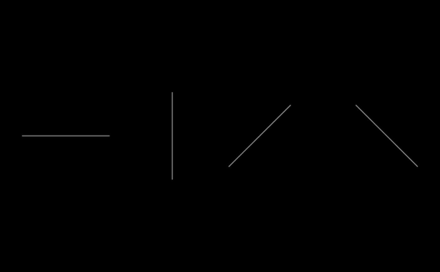
The graphic compositional trends are the simplest and most banal imaginable: horizontal, vertical, ascending diagonal and descending diagonal (3).

(3)
We have already observed how the horizontal course suggests a constant and slow motion, the vertical has similar characteristics to it in terms of slowness and constancy, however, it should be borne in mind that we usually trace it from bottom to top, thus constituting an upward movement, albeit without dynamism. The dynamic aspects are evidently perceptible in the two diagonals, ascending and descending, for this reason they are used in images that require action.
The first thing we have to ask ourselves is why do the diagonals seem to suggest dynamism? Let’s take a traditional rectangle with a horizontal course and observe it (4)

(4)
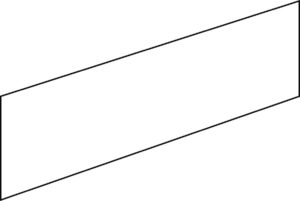
As well as having a horizontal elongation, it does not appear particularly active or dynamic; on the contrary, we would say it is static and immobile. If we change the inclination of the two elongated sides to that same rectangle, what happens?(5)

(5)
As we can see, the illusion we get is that it is no longer a flat shape, or, at least, we are in doubt as to whether to interpret it as a flat or three-dimensional figure, given that the inclination of the two sides seems to make them cross the space, even in the absence of perspective convergence. Here, then, we see the illusion of dynamism that our gaze assigns to the diagonals, precisely because of their property to cross the space.
Every visual text, be it pictorial, photographic, graphic, etc., is based on one of these four basic spatio-temporal compositional trends, but certainly on many occasions these elements can present themselves as composed, according to the expressive needs of the author.
For the moment, I will limit myself to giving a simple example of well-known and widespread visual texts linked to the dynamism of the diagonal. Think of Spiderman, as he is generally represented in action scenes: if he spins, hanging from his web, upwards and is going up, the tendency will be to place it diagonally upwards as in the example here https://moneyweek.com/wp-content/uploads/2018/11/920-spiderman-634.jpg; but if, while spinning always hanging from the web, the idea you want to suggest is that it goes down, in this case it is plausible to see it placed diagonally downwards as here https://3.bp.blogspot.com/-Eb0xd9nBLN0/WI1YFwdYjmI/AAAAAAAA7Os/0QXelBy00TQ7SF2WSBI15O1cGI1Q0cRgwCLcB/s1600/SMC%2B%25281%2529.jpg.
It is also likely that in many cases the arms or legs in turn constitute diagonal trends, an aspect that emphasizes more the dynamism, then further amplified by the framing often shown from below, so that the character dominates our gaze as readers or viewers. Nothing changes naturally if Spiderman is replaced by another superhero.
This is only a first and trivial example of the illusionistic tricks that the drawer or visual artist uses to express himself and make us live – and not just show us – something that, in fact, in the visual text does not happen; in fact, we, through our eyes and our psyche, assign that value to representation. Exactly as we would do with a magician or an illusionist during the execution of their trick: magic is given, and experienced, by not being able to understand the trick, even if we know that the trick is there.
Bibliography
AA.VV., Desideri in fiorma di nuvole. Cinema e fumetto, Paisan di Prato (UD), Campanotto Editore, 1996.
AA.VV., Gulp! 100 anni a fumetti, Milano, Electa, 1996.
AA.VV., Nuovo fumetto italiano, Milano, Fabbri Editori, 1991.
ARNHEIM Rudolf, Arte e percezione visiva, [1954], Milano, Feltrinelli, 2002.
BAIRATI Eleonora FINOCCHI Anna, Arte in Italia, [1984], Torino, Loescher, 1991.
BARBIERI Daniele, I linguaggi del fumetto, Milano, Bompiani, 1991.
BARONI Daniele, Il manuale del design grafico, [1999], Milano, Longanesi & C., 2006.
BOSCHI Luca, Frigo valvole e balloons. Viaggio in vent’anni di fumetto italiano d’autore, Roma-Napoli, Edizioni Theoria, 1997.
BRANCATO Sergio, Fumetti. Guida ai comics nel sistema dei media, Roma, Datanews Editrice, 1994.
CASETTI Francesco DI CHIO Federico, Analisi del film, Milano, Bompiani, 1990.
COSTA Antonio, Il cinema e le arrti visive, Torino, Einaudi, 2002
CHEVALIER Alain GHEERBRANT Alain, Dizionario dei simboli, [1969], Milano, Rizzoli, 2006.
DE GRANDIS Luigina, Teoria e uso del colore, Milano, Arnoldo Mondadori Editore, 1984
DE VECCHI Pierluigi CERCHIARI Elda, Arte nel tempo, [1991], Milano, Bompiani, 1996.
DE VINCENTI Giorgio, Andare al cinema, Roma, Editori Riuniti, 1985.
FAETI Antonio, Guardare le figure, [1972], Roma, Donzelli Editore, 2011.
FAVARI Pietro, Le nuvole parlanti. Un secolo di fumetti tra arte e mass media, Bari, Edizioni Dedalo, 1996.
FRESNAULT-DERUELLE Pierre, I fumetti: libri a strisce, [1977], Palermo, Sellerio Editore, 1990.
FREZZA Gino, La scrittura malinconica. Sceneggiatura e serialità nel fumetto italiano, Firenze, La Nuova Italia, 1987.
GOMBRICH, Ernst H. HOCHBERG Julian BLACK Max, Arte percezione e realtà, [1972], Torino, Einaudi, 2002.
ITTEN Jhoannes, Arte del colore, [1961], Milano, Il Saggiatore, 2001.
KANDINSKY Wassily, Punto linea superficie, [1925], Milano, Adelphi, 1982
MALTESE Corrado, Guida allo studio della storia dell’arte, [1975], Milano, Mursia, 1988.
PALLOTTINO Paola, Storia dell’illustrazione italiana, [2010], Firenze, VoLo Publisher, 2011.
PELLITTERI Marco, Sense of comics, Roma, Castelvecchi, 1998.
RAFFAELI Luca, Il fumetto, Milano, il Saggiatore, 1997.
REY Alain, Spettri di carta, [1982], Napoli, Liguori, 1988.
RICCIARDI Enrica, Il cuore delle nuvole. Arte figurativa e fumetto, Paisan di Prato (UD), Campanotto Editore, 1996.
SWEENEY Michael S., Dentro la Mente – La sorprendente scienza che spiega come vediamo, cosa pensiamo e chi siamo,, Vercelli, Edizioni White Star (per l’Italia), National Geographic Society, 2012
TORNAGHI Elena, Il linguaggio dell’arte, [1996], Torino, Loescher, 2001
Siti web


