In one of my previous speeches I dealt with the spatio-temporal trends inherent in the composition (https://www.danilosantinelli.it/danilos-blog/spatio-temporal-trend-of-the-composition/), for the sake of completeness I would now like to introduce some aspects concerning the three basic geometric forms, which are also precious compositional tools: square, circle and triangle.

The square, distinguished by its four equal sides and angles, has no motion, it seems to close on itself, apparently motionless in its solidity suggested by the right angles. The stability and concreteness inherent in this form have allowed, since ancient times, its adoption as a symbol of earth. Chevalier and Gheerbrant analyse it in one of the most interesting dictionaries of symbols ever written (Jean Chevalier – Alain Gheerbrant, Dizionario dei simboli, 1997 RCS Libri, Milan).
On the contrary, the circle appears to us in perpetual motion and its shape without corners gives it softness. If we draw a square, tracing the last of the four sides, we feel the need to stop, while drawing a circle, instead, our movement could continue to infinity, this form seems to rotate without stopping. Characteristics that have assigned to the circle an astral and spiritual symbolism that acts as a counterbalance to the square, becoming a visual metaphor since the antiquity of the celestial vault.
Among the oldest architectural testimonies we find the Ka’ba, a typical example of Arab construction with a cubic body surmounted by a hemisphere, a metaphor of union between earth and sky and between man and God.
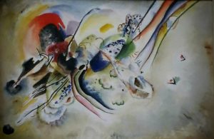
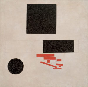
This dichotomy, in much more recent times, marks the work of Kandinsky and Malevich at the dawn of abstract painting. Since the Improvisations (a cycle of paintings on paper that mark the beginning of the painter’s abstract experience) in Kandinsky, curvilinear forms have prevailed over geometric ones, and chromatic expression has played a prominent role, so much so as to constitute the subject of his essay The Spiritual in Art. In it he investigates the spiritual value of color that relates to sounds, the affinity of Kandinsky’s pictorial research with music was already evident in the title of those first improvisations. Malevich, on the other hand, is one of the greatest exponents of geometric abstractionism and the founder of Suprematism, his vision is profoundly nihilistic, he prefers squares, rectangles and straight lines. The languages of these two great protagonists of twentieth-century art cannot be similar. They express opposing convictions that translate into different forms. Kandinsky’s curvilinear spirituality on the one hand and Malevich’s concrete and earthly geometric solidity on the other.


Vasilij Kandinskij, Composizione, 1916 Kazimir Malevič, Suprematist Composition, 1915
Finally, the triangle remains. Looking at it, our gaze tends to concentrate on the vertex, the angle that indicates the high, its geometric conformation makes it assume a role of arrow oriented to verticality.
Generalizing, therefore, we could say that the immobility of the square reminds us of the suspension of the point on the infinite white surface, the perpetual circular continuity reminds us of the infinite and slow horizontal movement, while the natural upward orientation of the triangle suggests vertical ascension (https://www.danilosantinelli.it/danilos-blog/spatio-temporal-trend-of-the-composition/).
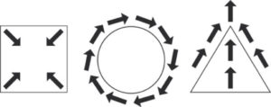
It should then be observed how these geometric forms, based on their structure and conformation, present forces acting abroad or inside them, determining them as closed or open forms.

To observe a square means to observe also its internal diagonals, even if absent, and their central crossing that constitutes an anchorage that determines it as absolutely motionless. The observation of the circle, as already mentioned, suggests its rotation. In the observation of a triangle we notice how the catalyzing presence of the vertex suggests verticality, both this illusory verticality and the two diagonal sides communicate ascent.
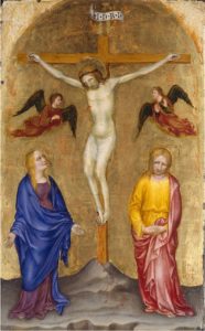
It is clear that the graphic-perceptive properties of these forms, and the symbologies that we have associated with them since ancient times, prove to be precious in composition and fundamental in graphic-advertising design, which requires a formal synthesis of immediate perception for the corporate identity expression of the clients, immediacy dictated by the total disinterest of the observer, or even of real annoyance on his part in receiving the message. Advertising communication has become so intrusive and omnipresent that it often causes irritation, so the reduction of perceptual time allows the unconscious transmission of the message even in the presence of indifference or intolerance of the observer. It is no coincidence that for many years, and often still today, banking and insurance companies have expressed their identity through the square: the aspects of firmness, solidity and concreteness of this geometric form naturally lend themselves to embody the value characteristics of these market sectors. Thus most of the logos in the automotive market are conceived on the circle, its perceptive rotation embodies the essentiality of the automotive movement determined by the rotation of the wheels. In painting, until the mid-fifteenth century, the triangle represented the fundamental compositional basis in the expression of countless crucifixions. A compositional aspect that becomes the embodiment of the subject represented: first of all in a hierarchical sense, allowing the face of Christ to be placed at the top, that is, at the focal point of this form, and Mary and Mary Magdalene at the two corners at the base as gregarious figures: in the symbolic sense, having three sides, the triangle becomes synonymous with the trinity and at the same time, according to the Christian symbolic tradition, the eye of God; in the sense of a graphic-spatial course, given the natural conformation of an arrow pointing upwards, the triangle suggests the subsequent ascent of Christ to heaven.

Gentile da Fabriano, Crocefissione, 1410
The qualities that we have always given to these geometric forms are not to be traced back to symbolic-cultural aspects in themselves. On the contrary, it is the graphic-spatial properties inherent in such forms, even if illusory because they are merely perceptive, that have allowed their assumption as cultural symbols of certain values and meanings, both within religious, monotheistic or polytheistic cultures and within culture in general.
Bibliography
ARNHEIM Rudolf, Arte e percezione visiva, [1954], Milano, Feltrinelli, 2002.
BAIRATI Eleonora FINOCCHI Anna, Arte in Italia, [1984], Torino, Loescher, 1991.
BARONI Daniele, Il manuale del design grafico, [1999], Milano, Longanesi & C., 2006.
CHEVALIER Alain GHEERBRANT Alain, Dizionario dei simboli, [1969], Milano, Rizzoli, 2006.
DE GRANDIS Luigina, Teoria e uso del colore, Milano, Arnoldo Mondadori Editore, 1984
DE VECCHI Pierluigi CERCHIARI Elda, Arte nel tempo, [1991], Milano, Bompiani, 1996.
GOMBRICH, Ernst H. HOCHBERG Julian BLACK Max, Arte percezione e realtà, [1972], Torino, Einaudi, 2002.
ITTEN Jhoannes, Arte del colore, [1961], Milano, Il Saggiatore, 2001.
KANDINSKY Wassily, Punto linea superficie, [1925], Milano, Adelphi, 1982
MALTESE Corrado, Guida allo studio della storia dell’arte, [1975], Milano, Mursia, 1988.
SWEENEY Michael S., Dentro la Mente – La sorprendente scienza che spiega come vediamo, cosa pensiamo e chi siamo,, Vercelli, Edizioni White Star (per l’Italia), National Geographic Society, 2012
TORNAGHI Elena, Il linguaggio dell’arte, [1996], Torino, Loescher, 2001
Siti web


