Illustration by Daniel Haskett (detail)
We have already observed how colour can create spatial artificialities (https://www.danilosantinelli.it/danilos-blog/spatial-use-of-colour/), but this process of showing something that does not exist in fact, is a practice usually used by authors of images, who through our experience of reality put us in a position of co-authors, or rather, assign us the task of completing the visual text. This aspect will certainly be clearer with the help of some examples.

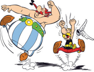
Looking at this image of Asterix, a character created by René Goscinny (screenwriter) and Albert Uderzo (draughtsman), we are surprised to imagine much more than it actually shows.
What is actually shown by Uderzo? We see Obelix and Asterix jumping enthusiastically, movement and gestures are emphasized by kinetic lines (Kinetic lines allow us to visualize the movement and movement of a subject, animated or inanimate, otherwise invisible to our eyes, it is not by chance that the kinetic lines were introduced with the intention of representing the speed of industrial civilization, to which the futurist painters praised and applauded). The two characters must necessarily make such a leap from a supporting surface, of which there is no trace, even if we imagine it. What we see in his place is a black hatching that we unequivocally read as the shadow of the two characters, although it does not have a credible form to be so. This happens because we are drawing on our experience, on our knowledge of the world, only thanks to it does the hatching become a credible shadow, and, only thanks to it, we visualize a ground that in fact does not exist.
Let’s come to an even more stunning example with an illustration by Zara Pickens.
A girl goes on a swing. The swing rope is defined by a line slightly lighter than the bottom, making it barely distinguishable from it. A dark spot forms the seat. It is autumn and the scene takes place in a garden, it is the leaves that make us visualize the season and the place, but they do not seem to be limited to this, showing us instead the oscillation of the swing, without them, in fact, we would have difficulty perceiving the coming and going.
If we look at the image without their presence, everything changes. Continuity and compositional balance are lacking, the girl appears as suspended, there is no trace of the season and the place becomes uncertain.

The author of the images shares these experiences with us, so he knows he can show us, through suggestions, things missing from the image.
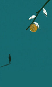
The example shown by Daniel Haskett’s illustration is even more extraordinary.
The image presents a branch with a hanging fruit, is diagonally oriented, as if to indicate the tiny figure that projects a shadow. Branch and figure are black, while the fruit is ochre and the leaves are white. A brilliant image in its absolute synthesis: formal, where branch and figure are silhouettes; compositional, with the dynamic use of the branch to highlight the presence of man; chromatic, with the use of only four colors. The branch, in synergy with the green of the background, suggests the natural environment. Its dimensional relationship with the figure, the framing from above. The dimension of man and his shadow, in relation to that of the branch, allow us to visualize a large space. It is truly amazing how Haskett, with only two elements, can make us imagine such a wide world. It’s actually the cover illustration of Nigel Balchim’s book A way through the wood, which we preferred not to show in its full title, as we didn’t want the reader to attribute the imagination of the places to the suggestion of that wood.

Bibliography
ARNHEIM Rudolf, Arte e percezione visiva, [1954], Milano, Feltrinelli, 2002.
BARBIERI Daniele, I linguaggi del fumetto, Milano, Bompiani, 1991.
GOMBRICH, Ernst H. HOCHBERG Julian BLACK Max, Arte percezione e realtà, [1972], Torino, Einaudi, 2002.
ITTEN Jhoannes, Arte del colore, [1961], Milano, Il Saggiatore, 2001.
KANDINSKY Wassily, Punto linea superficie, [1925], Milano, Adelphi, 1982
SWEENEY Michael S., Dentro la Mente – La sorprendente scienza che spiega come vediamo, cosa pensiamo e chi siamo,, Vercelli, Edizioni White Star (per l’Italia), National Geographic Society, 2012
TORNAGHI Elena, Il linguaggio dell’arte, [1996], Torino, Loescher, 2001
Siti web


