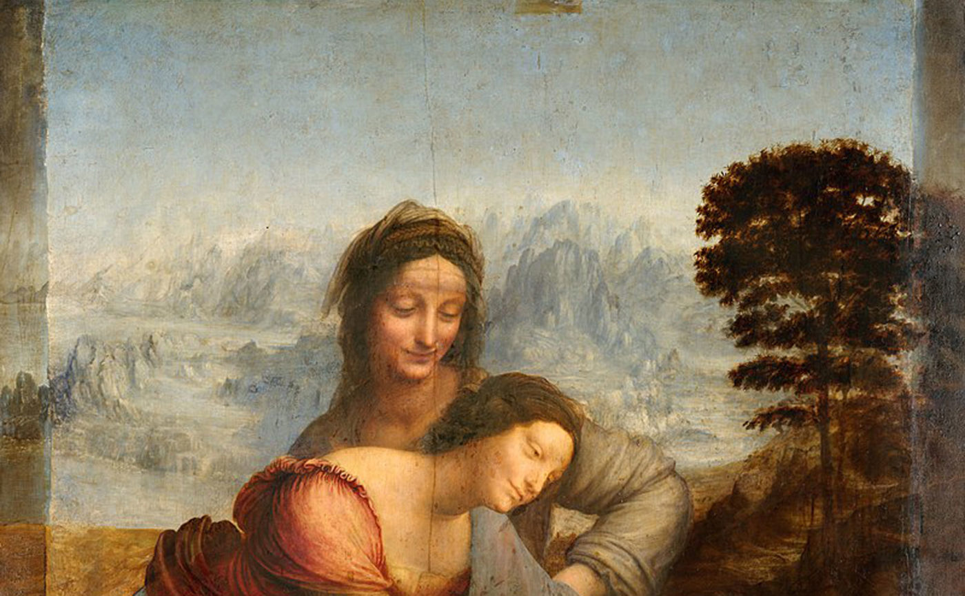
Leonardo da Vinci, St. Anne, the Virgin and Child with the Lamb (detail), 1510-13ca
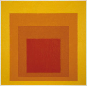
Colour has its own qualities of representation of space not connected to figuration. This is an aspect that Itten himself (Johannes Itten 1888-1967) debated in his essay Art of Colour (1961), but which we would like to exemplify here through the work (1) of an artist, also a lecturer at the Bauhaus like Itten, who deals with the spatial capacities of colour throughout his life. Josef Albers (1888-1976) was the first to conduct such a rigorous investigation into the expressive possibilities of chromatic spatiality, laying the foundations for the subsequent Optical Art which, from the 1960s onwards, conducted a close search for optical illusions and the perceptive possibilities of colour.

(1) Josef Albers: Homage to the Square: Glow, 1966
It is evident how, in his series of paintings Homage to the Square, Albers focuses on the illusion of depth that color can arouse. Our gaze is won over by the chromatic breakthrough of the surface. The yellow exterior clearly appears in the foreground, while the colours that form the internal squares gradually visually degrade, leading us to the orange-red that seems distant, at the end of the space. This overlapping of chromatic squares forms an undeniable visual corridor. Albers systematically studies the colour relationships with respect to their qualities of advancement and retreat, aspects that we have just described.
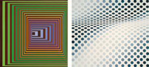
In the following example, taken from the work of Victor Vasarely (1906-1997) (2), founder of Op Art (abbreviation of Optical Art), the legacy of Albers is clear, but he loses his sobriety to go as far as the extreme consequences of optical illusion, of which we take an example with the work Bridget Riley (1931) (3), the other main exponent of this current. Within the research conducted by OP Art it becomes evident how the chromatic variations, linked to simple forms, are able to arouse a perceptive spatiality that does not exist in fact. A research that, through the installations will become physically spatial, through the use of lights and reflective materials that involve and react with the environments, as in the work of Julio Le Parc (1928) or Heinz Mack (1931), to name but two.

(2) Victor Vasarely: Vonal-Stri, 1975 (3) Bridget Riley, Hesitate, 1964
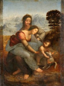
More generally, even in traditional figuration, colour is usually used for a more effective rendering of spatial depth, where it accompanies the elements already prepared by the drawing in a perspective sense: hence the elements of the background, that is those that appear more distant, will generally be characterised by lighter tones, tones that will become more intense as we approach the viewer’s point of view. It was precisely in the Renaissance that Leonardo (4), in order to achieve a more effective mimesis of the spatial depths, adopted an aerial perspective that also tended to reproduce the effects due to the presence of the atmosphere and for which the hills in the distance appear blue and the contours of the subjects, animated and inanimate, became indefinite, tending towards their greater interpenetration.

Leonardo da Vinci, St. Anne, the Virgin and Child with the Lamb, 1510-13ca
Here too, as in the case of mathematical perspective, what the author of images shows and proposes to the observer is not reality, but rather how it appears to our eyes. Just as perspective shows a convergence of elements that move away from our point of view, even though they do not exist in reality, so aerial perspective shows the most indefinite subjects as they move away and their chromatic lightening, reproducing, also in this case, not reality but our limited optical-visual possibilities.
Bibliography
ARNHEIM Rudolf, Arte e percezione visiva, [1954], Milano, Feltrinelli, 2002.
BAIRATI Eleonora – FINOCCHI Anna, Arte in Italia, [1984], Torino, Loescher Editore, 1991.
BARONI Daniele, Il manuale del design grafico, [1999], Milano, Longanesi & C., 2006.
CHEVALIER Alain GHEERBRANT Alain, Dizionario dei simboli, [1969], Milano, Rizzoli, 2006.
DE GRANDIS Luigina, Teoria e uso del colore, Milano, Arnoldo Mondadori Editore, 1984
DE VECCHI Pierluigi CERCHIARI Elda, Arte nel tempo, [1991], Milano, Bompiani, 1996.
GOMBRICH, Ernst H. HOCHBERG Julian BLACK Max, Arte percezione e realtà, [1972], Torino, Einaudi, 2002.
ITTEN Jhoannes, Arte del colore, [1961], Milano, Il Saggiatore, 2001.
KANDINSKY Wassily, Punto linea superficie, [1925], Milano, Adelphi, 1982
MALTESE Corrado, Guida allo studio della storia dell’arte, [1975], Milano, Mursia, 1988.
SPIZZOTIN Pierantonio a cura di, Il Quattrocento in Europa, in I secoli d’oro dell’arte, Milano, Orsa Maggiore Editrice, 1988
SWEENEY Michael S., Dentro la Mente – La sorprendente scienza che spiega come vediamo, cosa pensiamo e chi siamo, Vercelli, Edizioni White Star (per l’Italia), National Geographic Society, 2012
TORNAGHI Elena, Il linguaggio dell’arte, [1996], Torino, Loescher, 2001
VALLIER Dora, L’arte astratta, Milano, Garzanti, 1984.
WORRINGER Wilhelm, Astrazione e empatia, [1908], Torino, Einaudi, 1975.
Website


